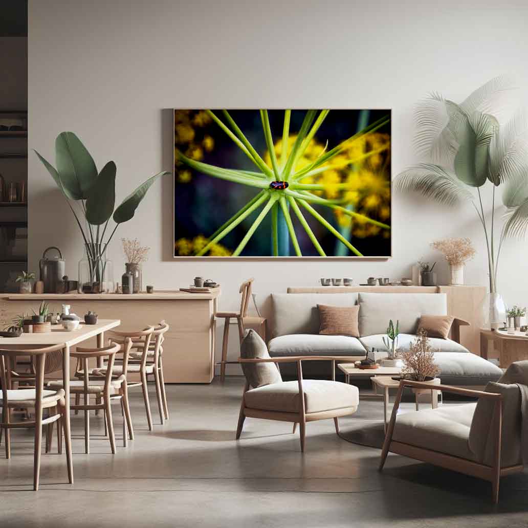
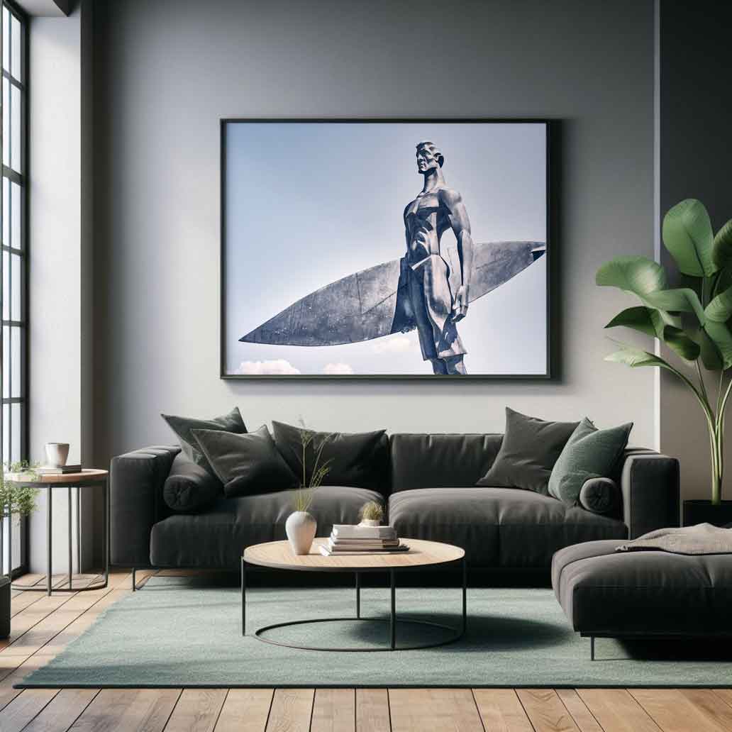
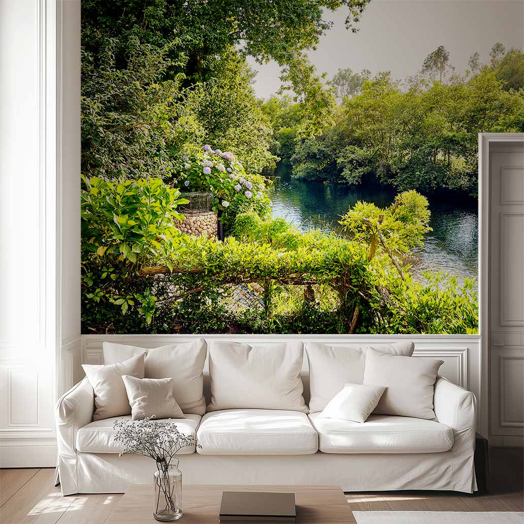
As a photographer, I understand that feeling. You fall in love with a work of art and your mind immediately projects it onto a massive scale: you want to immerse yourself in its beauty, its power, the emotion it evokes. You see that masterpiece so large that, to fit it, you’d have to rearrange your living room furniture or need a wall you don’t have.
That tension between desire and reality is the starting point of this guide.
Choosing the right format is not a trivial matter; it’s the final decision that determines whether your artwork will go unnoticed or become the focal point of the room. At fotos-art.com, we understand that the artwork you choose is the most powerful statement of intent for your space.
That’s why I created this Ultimate Guide. I’ll help you apply professional design principles to choose the perfect scale, ensuring your artwork not only “fits” but commands the space with authority and visual harmony, without the need to knock down walls.
1- The Golden Rule in Decoration: Buying Art is Not the Same as Filling a Space.
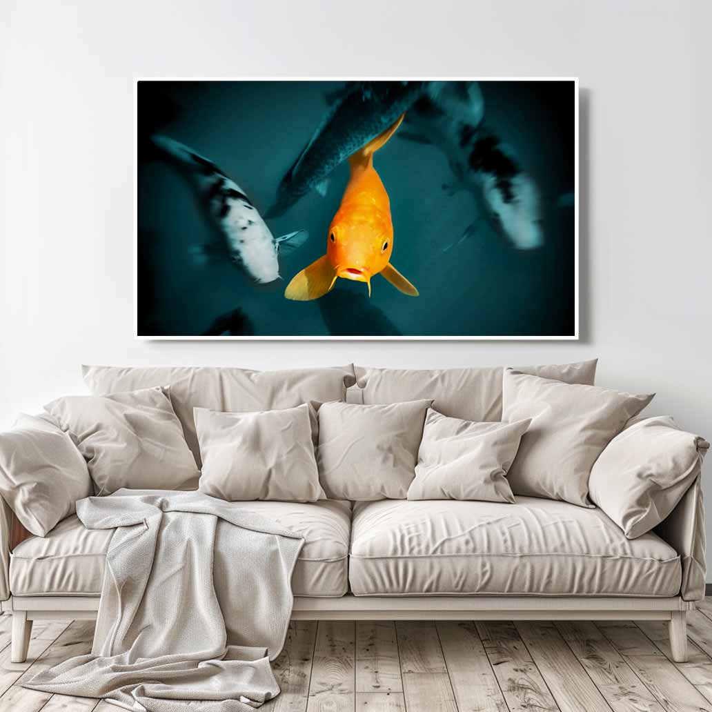
The most common mistake I see among novice decorators is underestimating scale. Artwork needs presence and breathing room on the wall. A piece that’s too small becomes an insignificant postage stamp on a blank canvas, and this negatively impacts the visual harmony of your living room, bedroom, or office.
The value of your photograph (and therefore the license you purchase) increases exponentially when its size is appropriate for the space it occupies. It’s time to think big and use professional judgment.
The 60-75% Principle: How to Measure the Perfect Proportion.
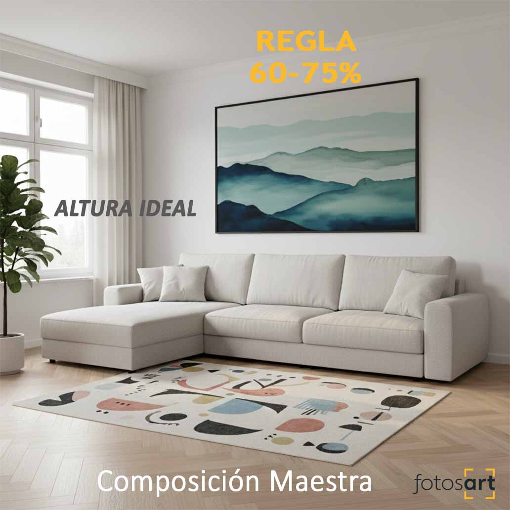
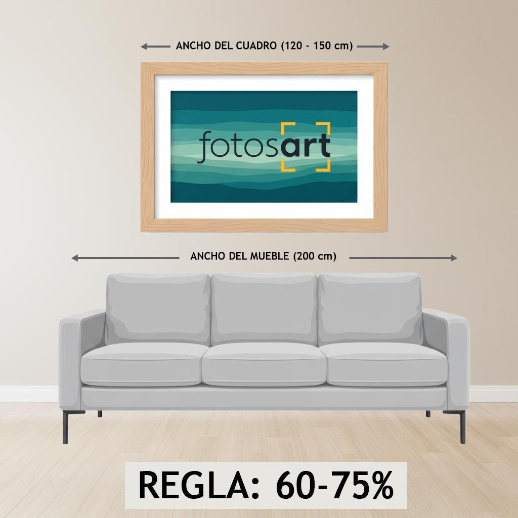
To ensure that your fine art photography is not “swallowed up” by the furniture, I apply a fundamental principle in interior design: the 60-75% rule.
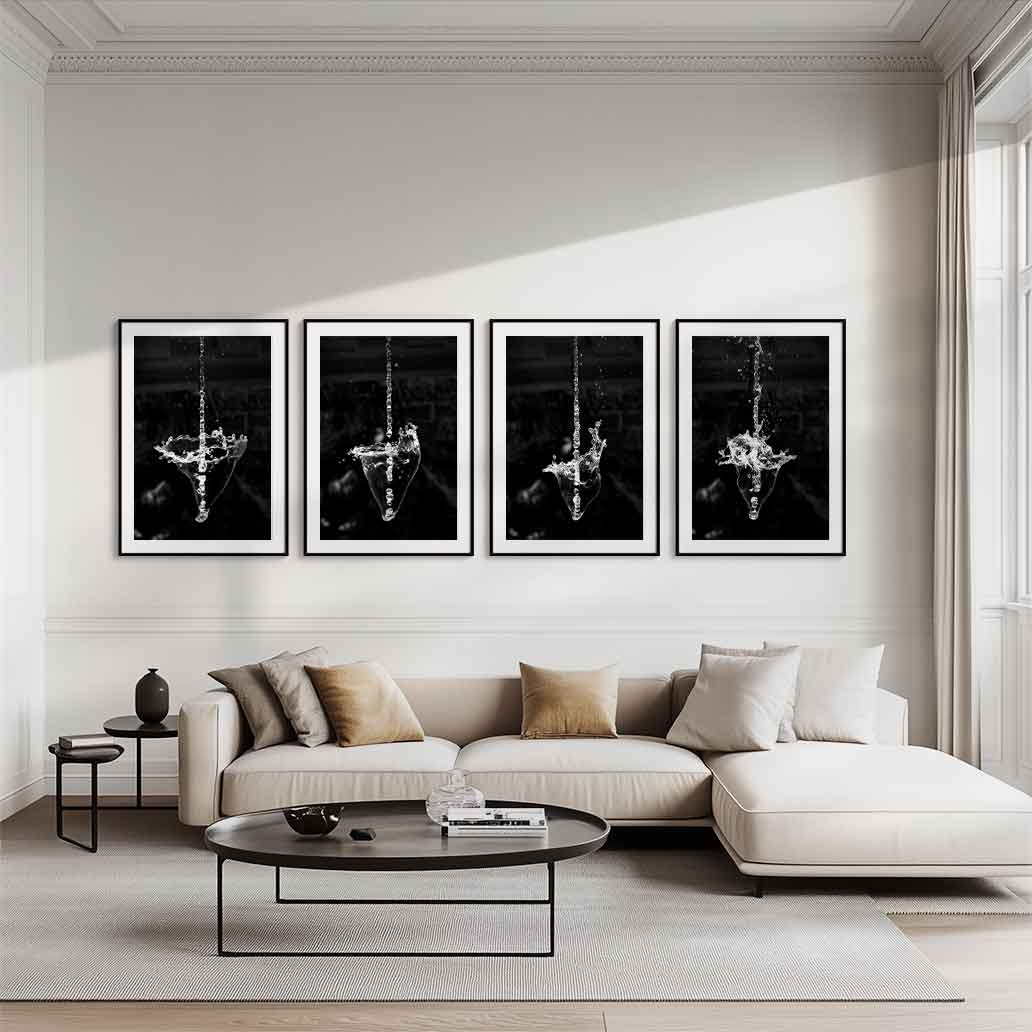
When you are going to place your artwork above a main piece of furniture — such as the living room sofa, the fireplace, the hall furniture or the headboard of the bed —, the width of your painting should (ideally) occupy between 60% and 75% of the width of the furniture below it.
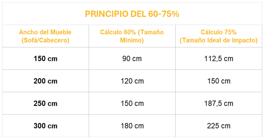
Practical conclusion: If your sofa is 2 meters long, the fine art photograph you purchase from my gallery should be at least 120 cm wide if you want to achieve a real aesthetic impact.
2- Formats, Scale and the Visual Impact of High Resolution.
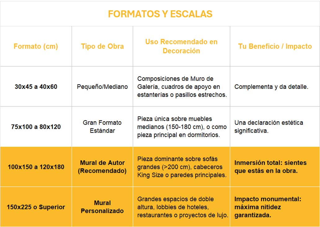
My art photography licenses are designed for the most ambitious format: the one that transforms a simple wall into a private art gallery. While it’s true that the versatility of my high-resolution files allows you to print in any format—from a small 30×40 cm to the size of a standard letter—the true fotos-art.com experience begins when you dare to go big.
The technical quality of each pixel, the richness of the color, and the detail of the composition are only fully realized in large murals. These are the formats that truly transform the energy of a room, turning a wall into an immediate visual statement.
Below is a guide that balances the most common sizes you might find:
DISCOVER MY HIGH-RESOLUTION LICENSE GALLERY AND TAKE THE STEP TO LARGE FORMAT
3- The Right Height: The Mistake of Hanging Art “Too High”.
After choosing the perfect format, only one crucial decision remains: the height. My experience as a photographer and interior designer has taught me that the vast majority of people hang their artwork too high, causing the piece to visually disconnect from the rest of the room.
A well-hung painting should blend into the visual flow of your home; it should feel accessible, not inaccessible. Here’s the simple rule I always use to achieve the perfect balance.
The “Point of View”: The Key to Average Height (1.45 – 1.60m).
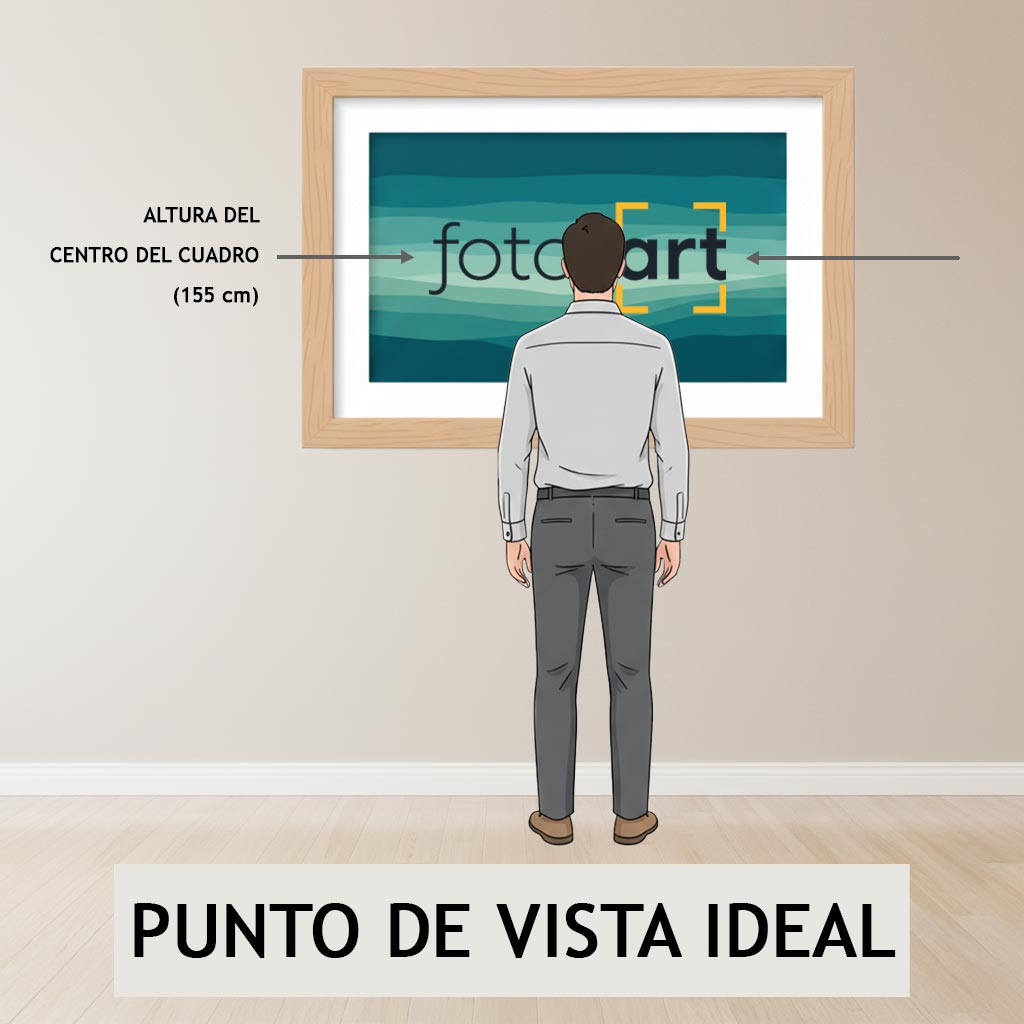
In art galleries and museums around the world, works of art are hung so that their center is approximately 1.55 meters from the floor. This is the average height of the human eye, the so-called ideal “Viewpoint.“
My recommendation for your home:
- General Rule (Empty Walls): If the wall is clear, the center of your photograph (yes, the exact center of the artwork, not the hanger) should be between 1.45 and 1.60 meters high, depending on your ceiling height. Aim for 1.55 meters..
- The Practice: Measure 1.55 m from the ground and mark that point. That will be the center of your artwork, regardless of its size.
Adjustments for Sofas and Headboards: The Minimum Breathing Space.
When the artwork is placed on a piece of furniture (which is most common in decoration), the rule changes slightly to give the painting a “breather”.
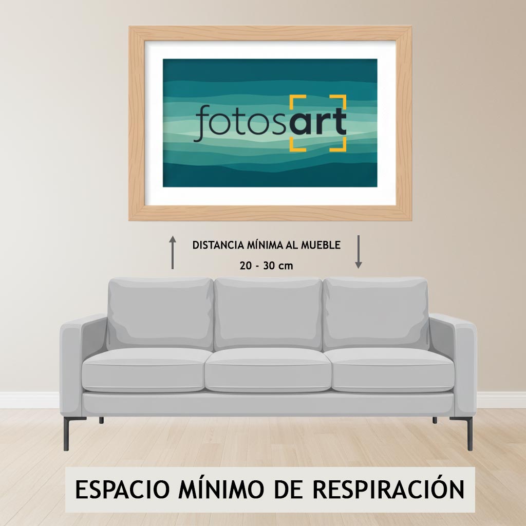
- Minimum Distance to Furniture: The bottom edge of your wall photograph should be at a distance of between 20 and 30 cm above the top edge of the sofa, the headboard of the bed or the furniture you use for support.
The reason: If you hang it closer, you risk someone sitting on the sofa brushing against the artwork. If you hang it further away, you break the visual connection, and the painting again appears to float without anchor.
4- Master Composition: The Elegant Solution for Collecting in Series.
What happens when you like several works from my gallery and want to integrate them into the same space?
The professional answer lies in serial composition. A diptych, a triptych, or a sophisticated Gallery Wall is not just a way to display more art, but a refined technique for creating rhythm, depth, and a cohesive visual narrative on any wall.
Diptychs and Triptychs: The Power of the Visual Link.
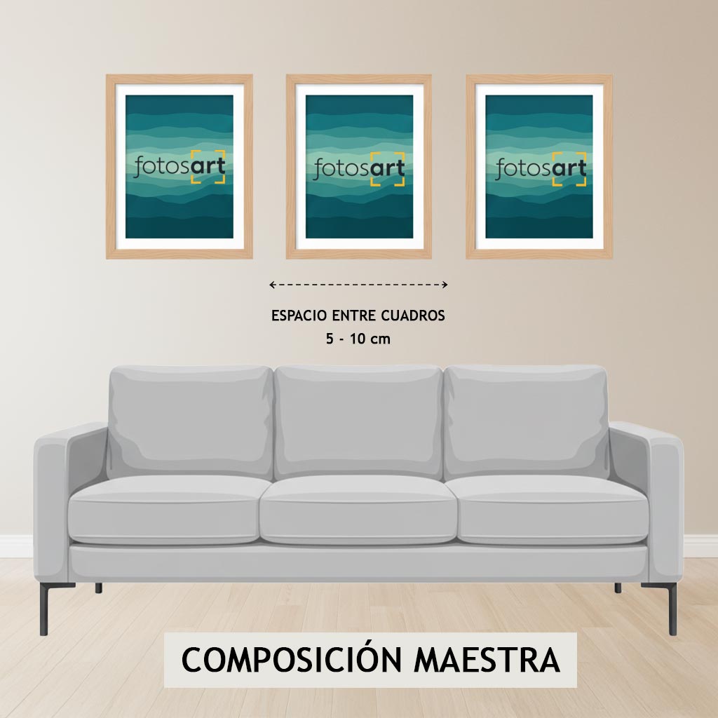
The diptych (two pieces) and the triptych (three pieces) are the most elegant solutions for covering large widths and creating movement without the density of a single mural.
The Rule of Space:
- The Minimum Link: The secret to making a composition feel like a single work and not like separate paintings lies in proximity.
- Expert Recommendation: I recommend leaving a space of 5 to 10 centimeters (maximum) between the formats. This space is crucial; it acts as a visual pause that allows the eyes to move smoothly between the pieces, maintaining compositional unity.
The Ultimate Immersion: When Photography Becomes a Mural.
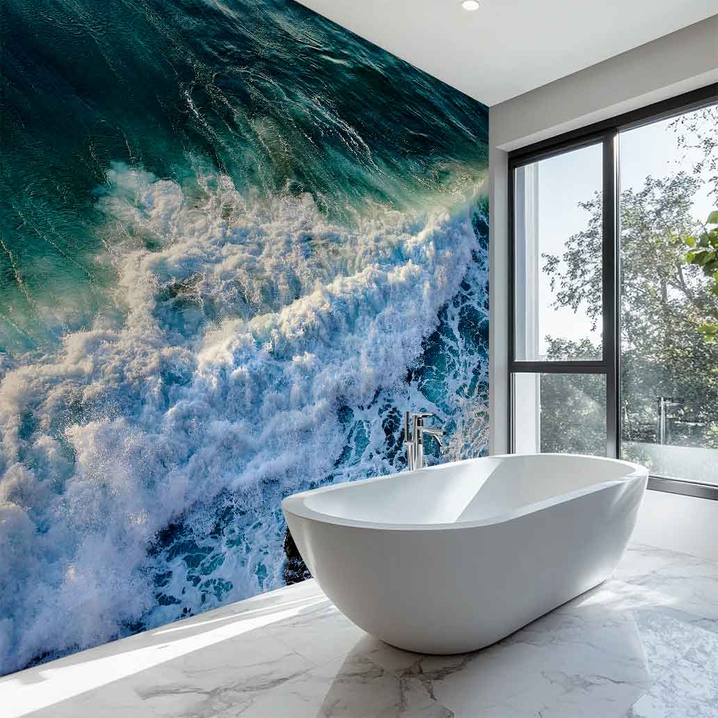
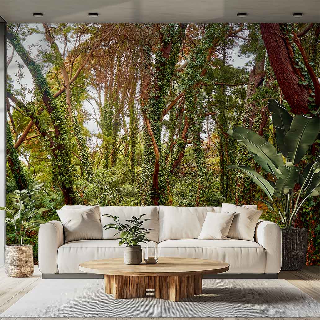
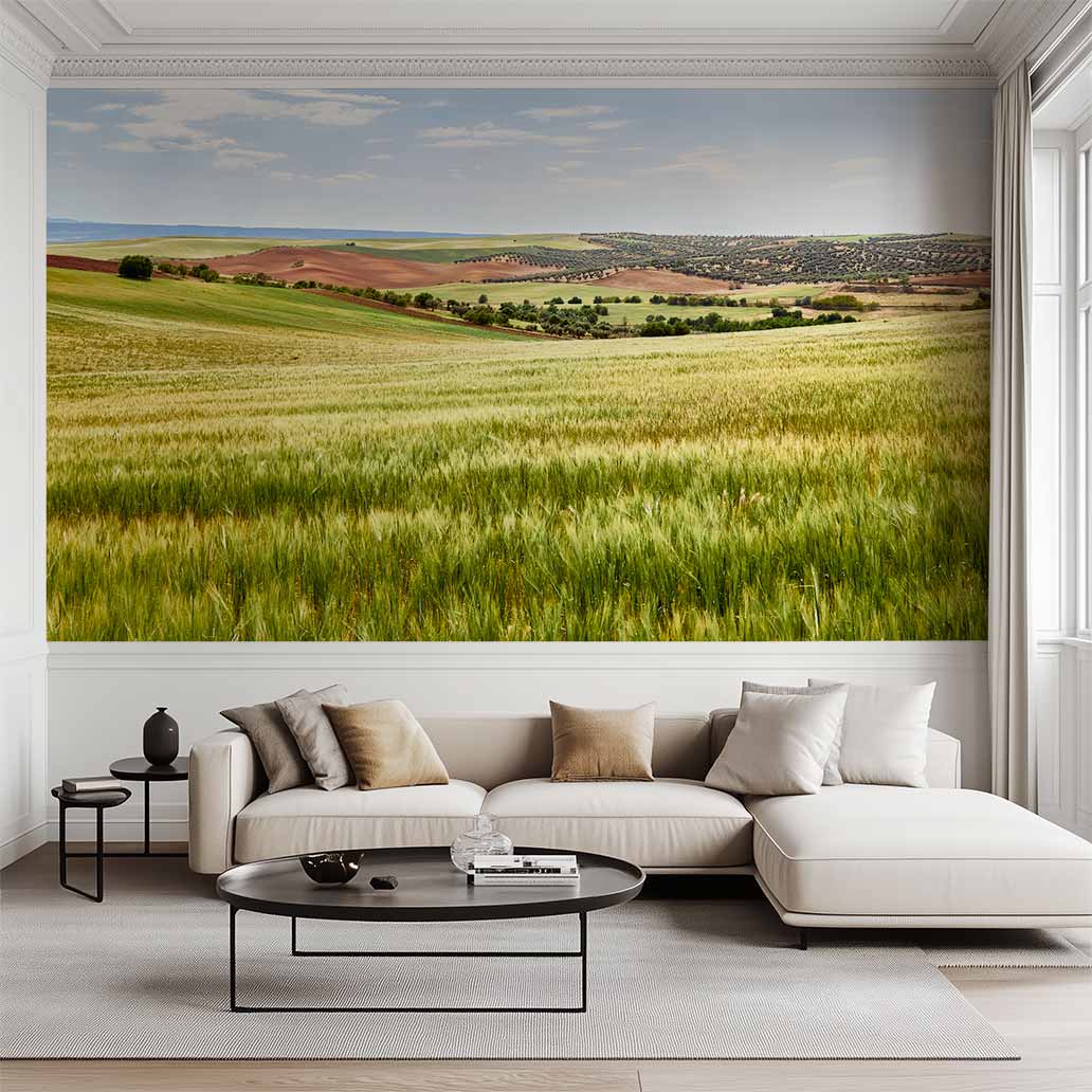
This is the hallmark of fotos-art.com. If your desire is to be completely immersed in the emotion of the artwork, transcend the 60-75% rule, and transform an entire space into a design statement, the solution is a full-wall mural print.
En este escenario, el arte deja de ser un objeto colgado y pasa a searquitectura visual de la estancia.
Mi Consejo para la Inversión Máxima:
- The goal is visual expansion: The photograph should extend across and dominate the wall, leaving only a minimal margin (10-15 cm) to the ceiling and side walls. This effect creates an immersive experience and eliminates any sense of a “floating picture”.
- License Advantage: The main advantage of purchasing your high-resolution license from me is the guarantee that the file will support the dimensions of a 3 or 4 meter wall without any loss of detail. This is crucial when you’re aiming for that immersive impact that defines a truly bold design.
If you’re looking for more ideas to justify this bold step and want to see how large-format prints can transform spaces, I invite you to visit my inspiration guide where you’ll find more ideas for decorating with fine art photography.
Conclusion: The Design is Yours, The Quality is Mine
Choosing the format and location for your fine art photography is an act of conscious design. You already know the drill: the key lies in large format to maximize visual impact, applying the 60-75% rule for proportion, and centering the art at eye level (1.55 m).
My mission is to provide you easy access to professional quality files (150 ppi and 300ppi), optimized so those large prints look sharp and perfect in your home, without technical complications.
Your wall doesn’t need a million-dollar investment to transform, just the right image. Stop second-guessing the measurements and start enjoying your space.
